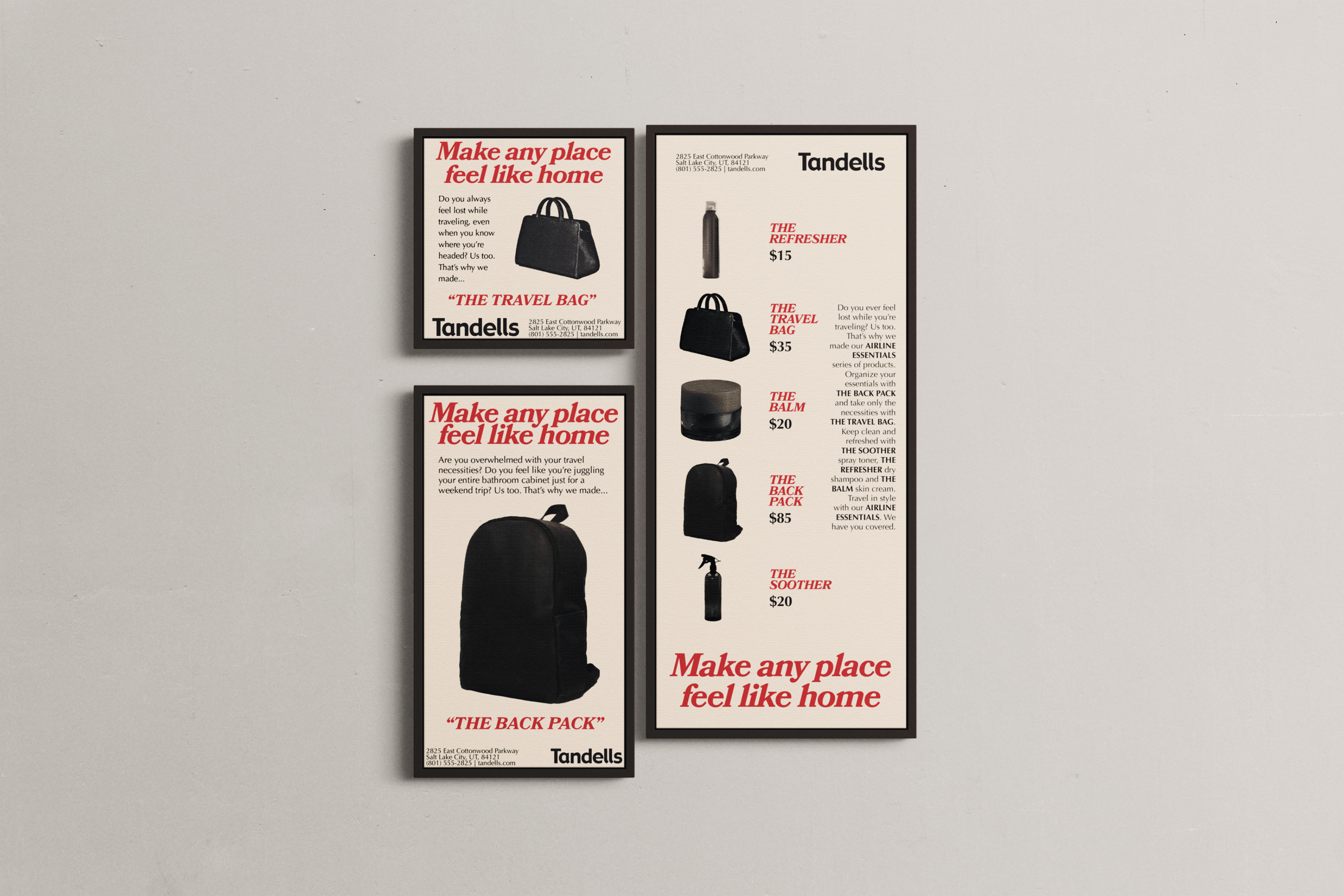
Ads intended to be an Instagram post, Instagram story, and print ad.
I had a very strong idea about what I wanted for this series pretty early on. As with many of my projects, I got pretty attached to the idea of working in black and white, which backfired a little when it came to adding color.
If I were to do this assignment again, I would make sure to get better paper. The cardstock I had at home is high quality, but does not show colors well and it ended up looking duller than I would have liked.
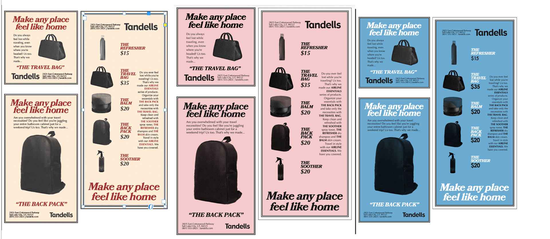
The three color combinations I was considering.
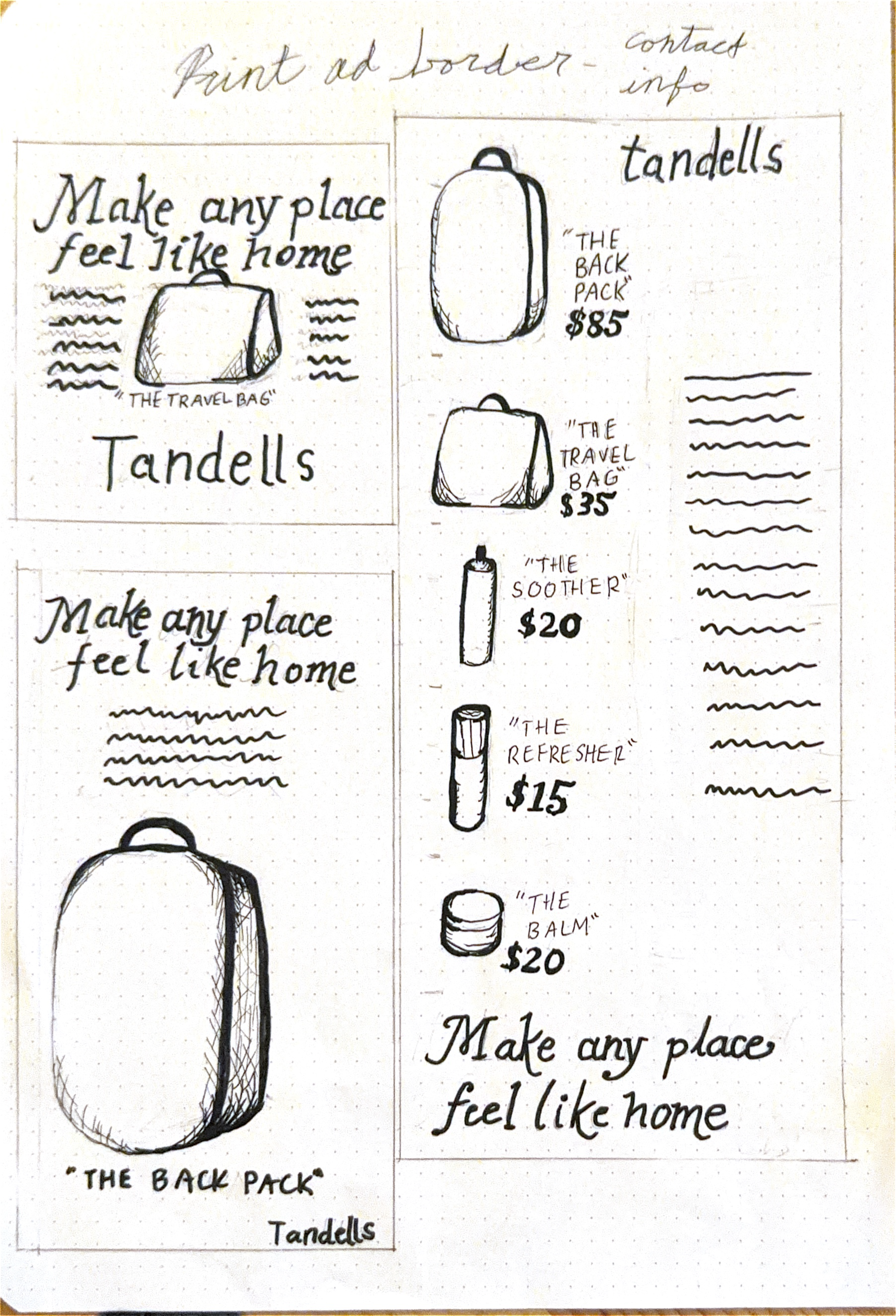
Hand composition