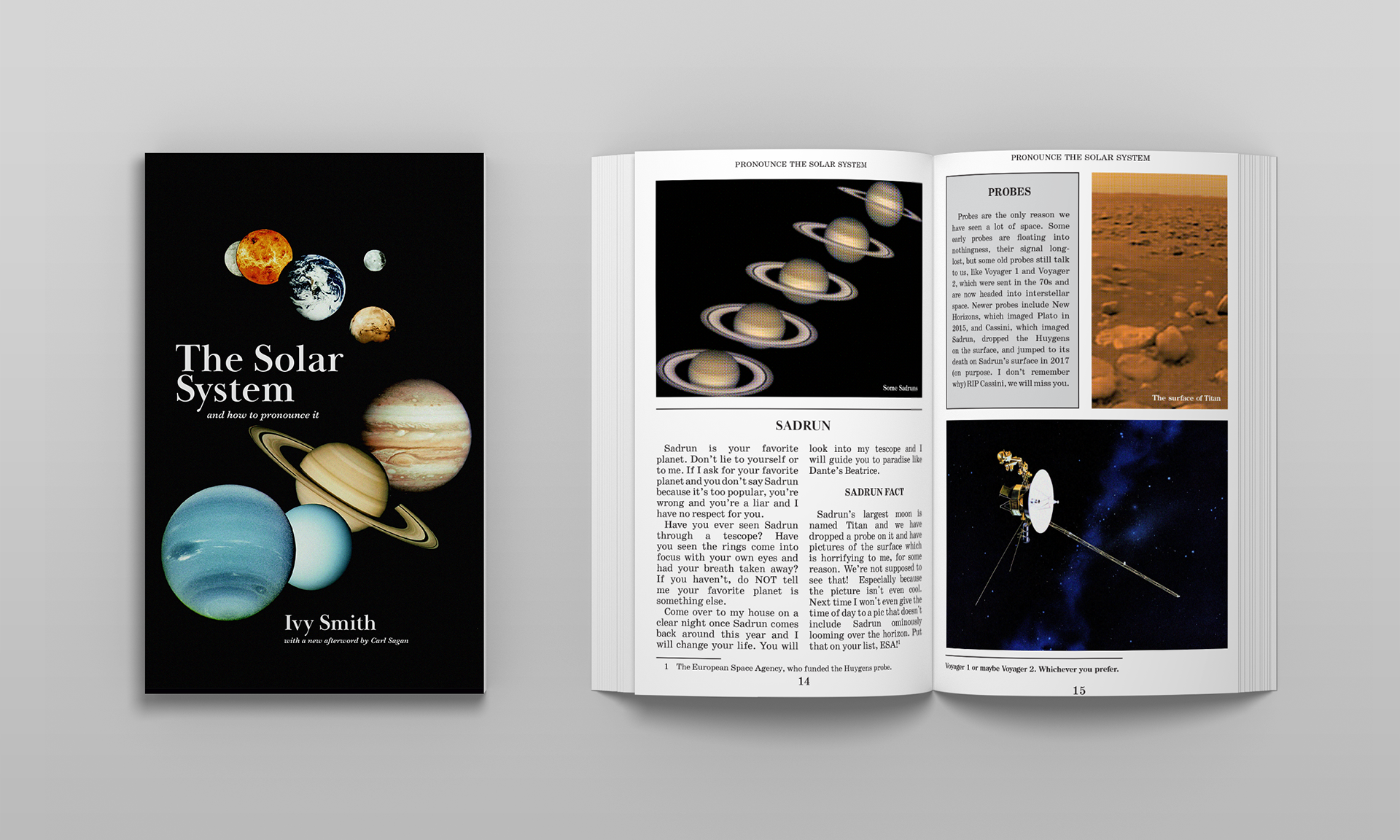
The booklet was our largest and final project in this class. The process of designing it lasted throughout the semester.
I originally had a different idea of what I wanted to create, but the content of that ended up not working out for me logistically. Instead, I had the idea to make a book about how to pronounce the solar system based on how my toddler does. It eventually evolved into what is essentially a small book of jokes.
My inspiration for this style of design was old science textbooks. I was so dedicated to it, in fact, that I ran all of the photos through a halftone filter in photoshop to simulate an older print style. That has caused some funky things when viewing the file digitally, as you can see below.
My initial plans for this were much less colorful. I originally imagined it completely in black and white, then greyscale, but my instructor suggested that having color for the planets would be good, which seems very obvious in hindsight. I'm super happy with the end result of this project and I think it's my favorite one I've done in my degree.
Some images from earlier in my process.
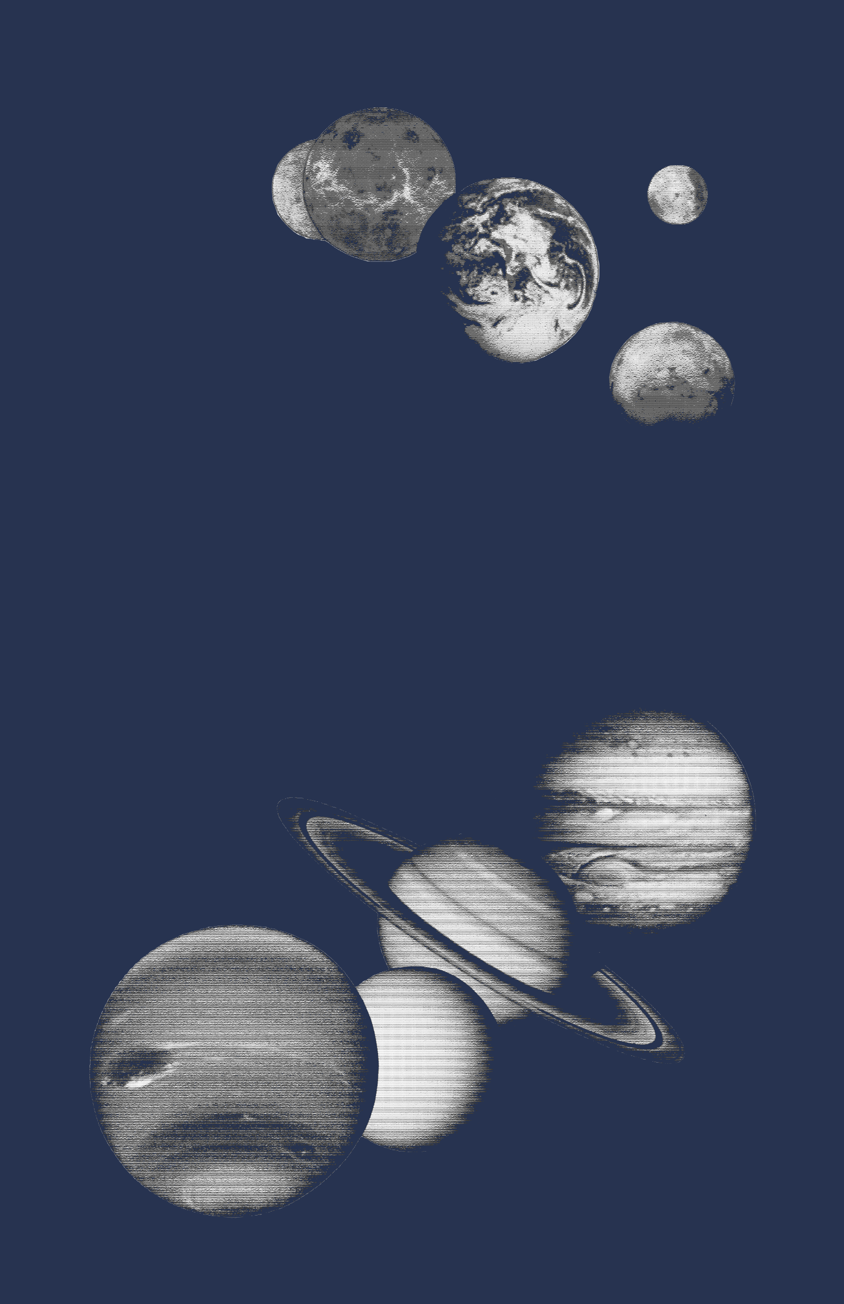
An earlier version of the cover image. For a long time I couldn't decide on a typeface or style for the cover - eventually I chose Baskerville as a placeholder and it ended up fitting the look perfectly.
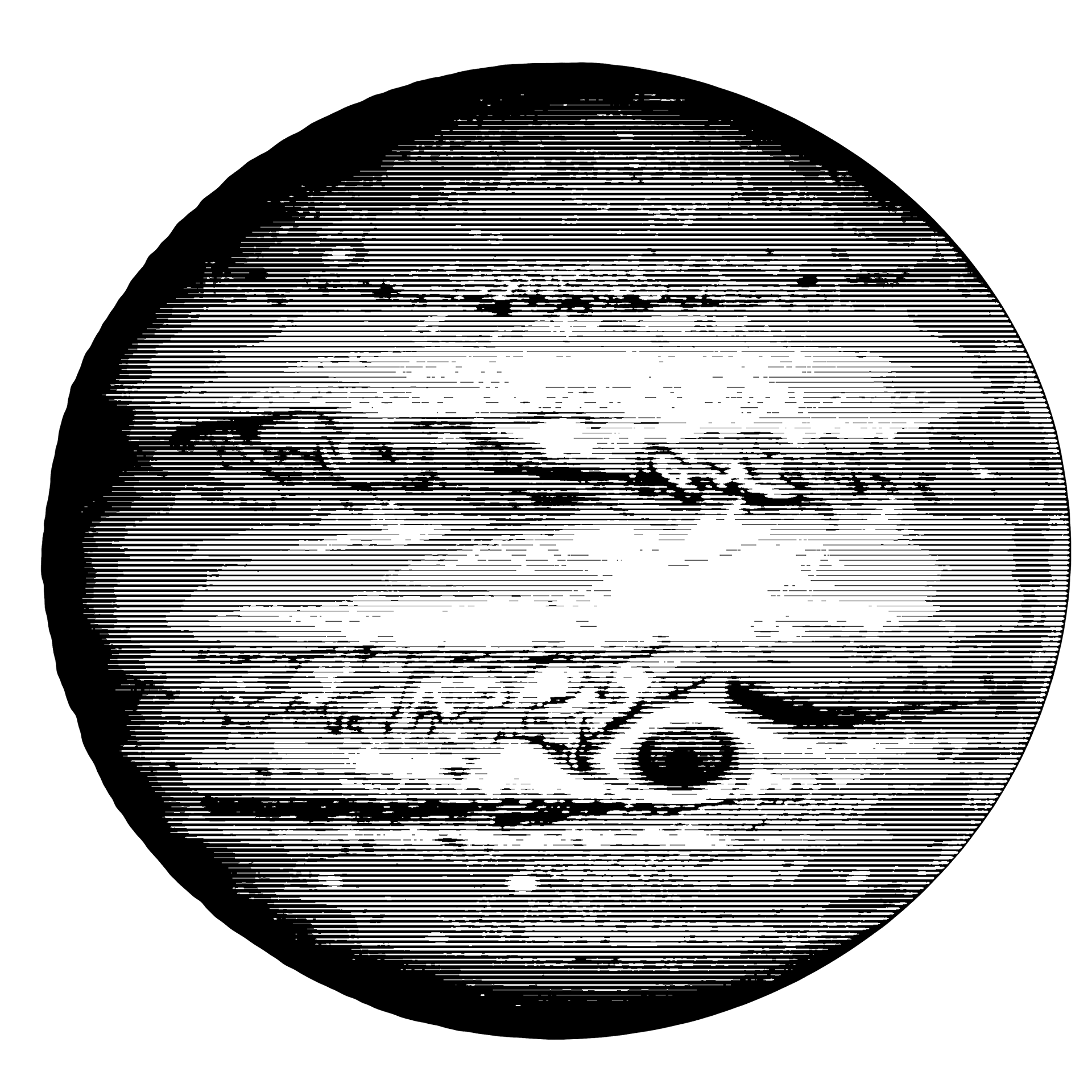
One of the images from my initial black and white draft. To create these ones, I posterized, changed to grayscale, and made a line bitmap. I was pleased with the result and kind of sad to leave them be.