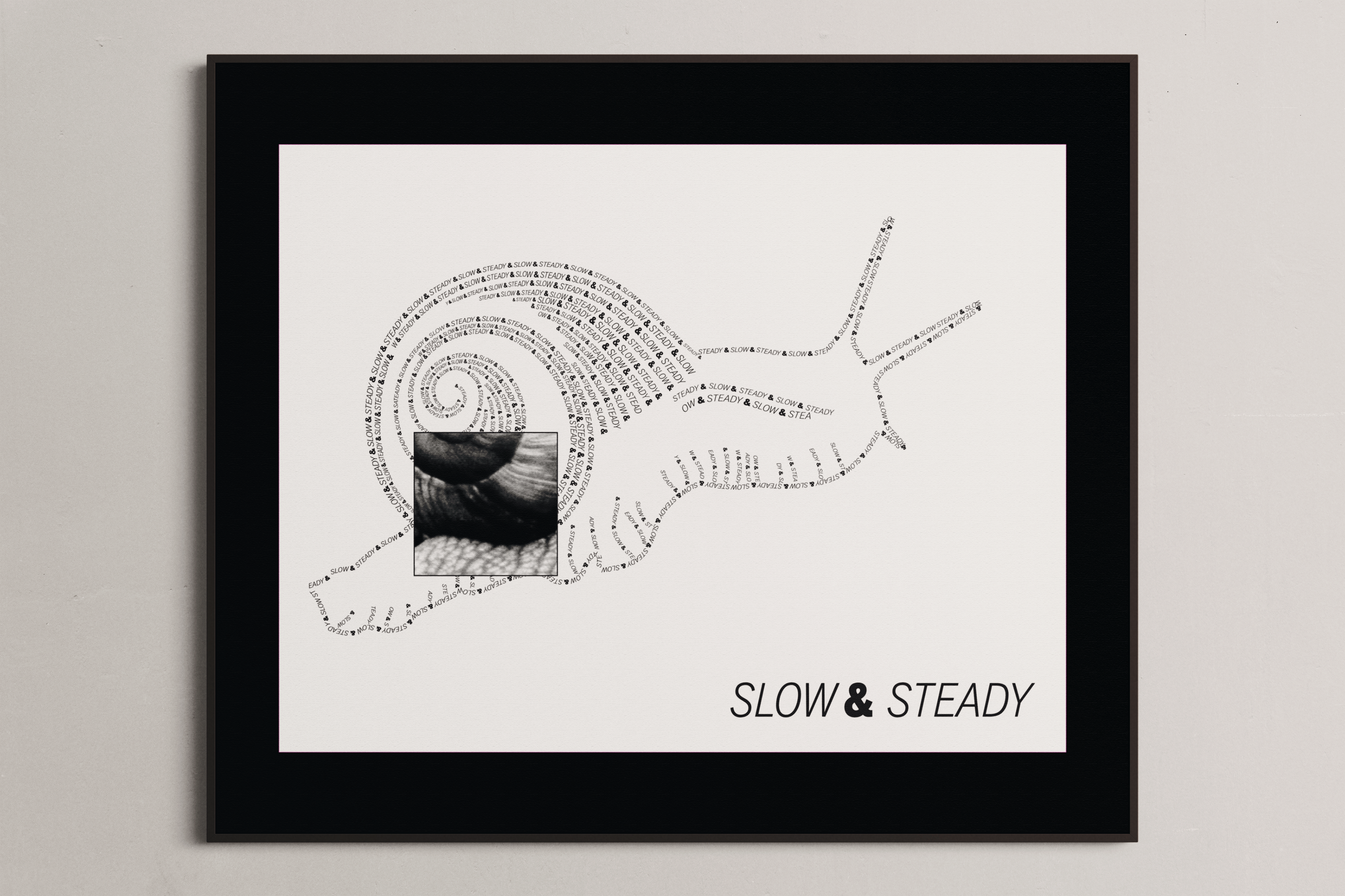
This was the first project of the semester and definitely an intense way to jump into the class. Doing the full type figure shape by hand took a very long time and some of the options were limited without being able to manually distort the letters.
Looking back, I do think I would have benefited a lot from focusing on more texture and dimension where the shell starts, but I'm pleased with much of the rest of the design. It was also a great chance for me to practice using illustrator more, which I am typically not great at.
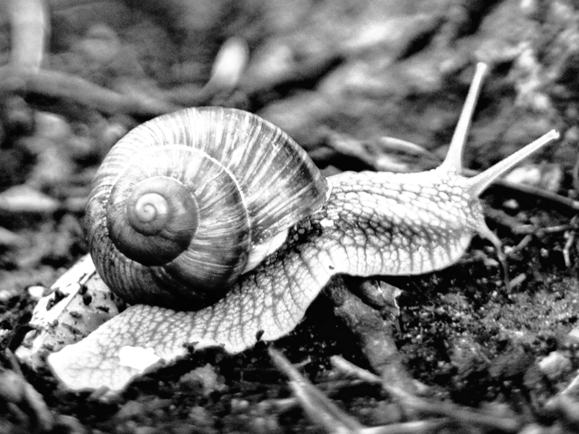
Initial image, which is seen peeking through the square of the final product
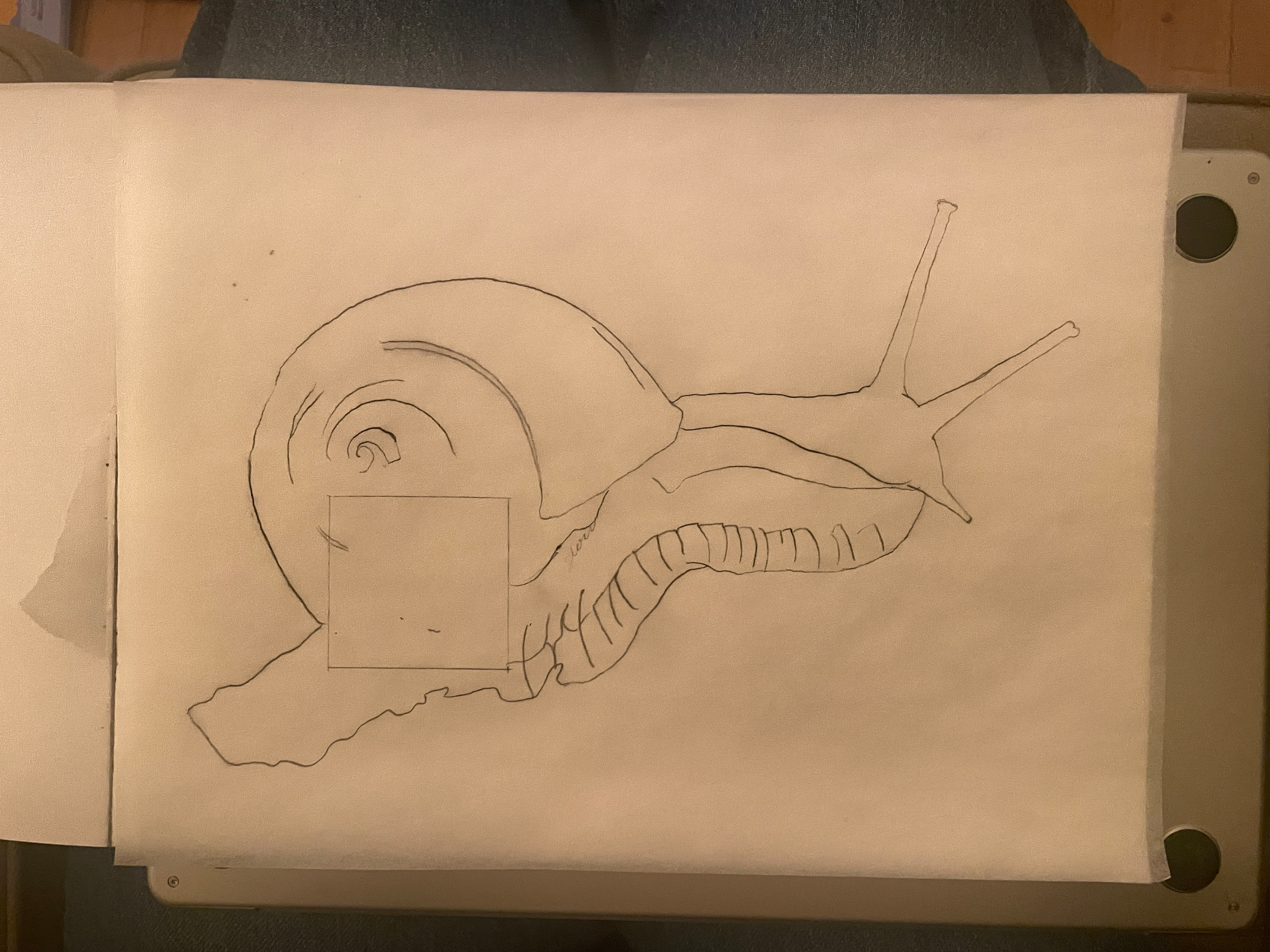
The line drawing which I used creating the figure.